Straightforward Color Tips for Web and Blog Design
One of the key components of web and graphic design is color.
Color can be one of the hardest things to get right, and after one or two missteps and you have a mess on your hands.
Color theory is fun since it stems back to psychology (what colors evoke which moods) and science (how light plays with color and how our eyes see color). If you've been to formal design school, you've probably heard all of the color rules at least 5 times.
I could go on and on about primary colors, secondary, monochromatic, analogous, complementary, etc. If you're looking for traditional color theory, I recommend googling it.
What I'm here to do today is relate color to your blog and website design: how to use it, when to use it, and when not to use it. With these simple tricks, you'll be on your way to reimagining your blog design to do it yourself or to work with a designer.
Pin for later
Think in Black and White First
The first thing you want to focus on in terms of your web presence is your content: What goes where, what links and navigation take precedence, what content is the most important, etc.
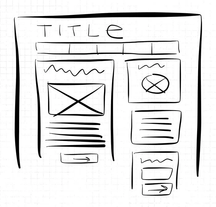
Do this in black and white. Even better, draw nondescript boxes on a piece of paper and work it out with pencil before opening Photoshop.
Work with Pre-Existing Colors
Now that you have your general layout, think about whether you have pre-existing colors. This could be from your company's logo or from your previous blog design. After all, colors have a lot to do with branding, so you don't want to jump into a whole new color scheme since it may end up confusing your audience.
If you have a color in mind from previous branding or design, grab its hex code (6 character code with letters A through F or any number, followed by a # sign) in Photoshop or a browser extension tool. If you have several pre-existing colors, choose the most dominant one. That could either be the color that occurs most in the design, or the most dominant and eye-catching color.
Choose a Color That Works With Your Branding
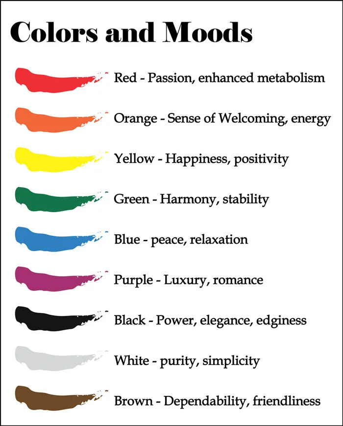
If you don't have a pre-existing color, you can have some fun with choosing one. The best thing to do here is to think about your blog or brand, and come up with a handful of concept words describing your site's tone or your company's mission. Concept words could be something like: playful, professional, optimistic, trustworthy, etc.
From your 3 or 4 concept words, see if there are any encompassing themes and choose an overall mood. From there, do some basic color mood research and choose a color. If you choose red, you're not limited to bright red; we'll get to that in the next step.
Pick a Color You Like
If you're really starting from scratch and you're not sure about the color choice, just choose a color that is appealing to you. There's a chance that if you like the color and you're the one creating the content, the color will be just right for your site (this particularly works for bloggers since it's usually a one-woman or one-man shop).
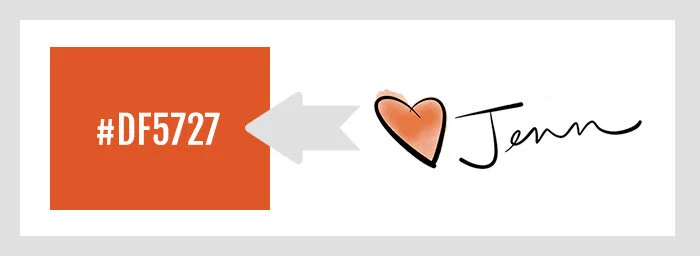
For example, I chose a red using the eyedropper tool in Photoshop from the heart in my blog post signature.
Run With Your Chosen Color - The Color Calculator
So now, you have your black and white design, with content situated in its proper place. From here, you can begin to paint your design with your color.
Notice I say "color". While you can absolutely move ahead with multiple colors in your design, you will end up with a more cohesive design if you choose one color and use variations on it.
(Safe) variations can be one of the following:
Tints, or variations on the color with opacities of white on top
Shades, or variations on the color with opacities of black on top
Saturations, how much of the hue of the color is added or subtracted
My best color tool? Serennu Color Calculator. I can't be sure when or why I came across this site, but it's something I rely on heavily and use whenever I'm working with color.
Hello Brio Color Story: An Example
So again, I chose my color from my old blog post signature.
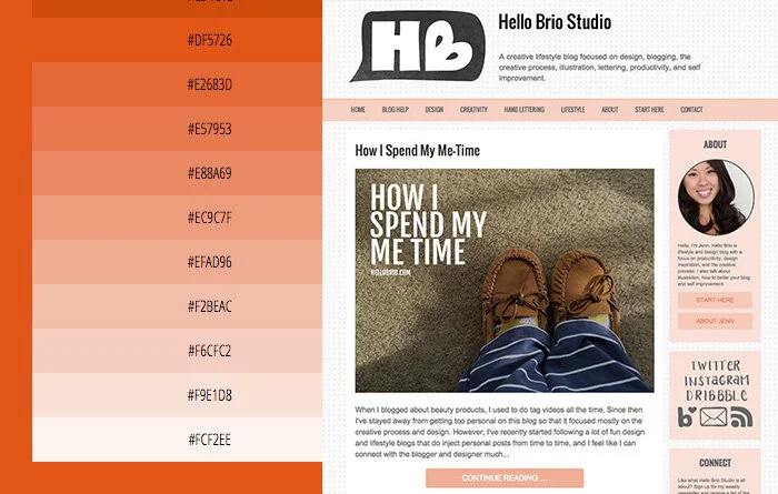
If I plug in my #DF5727 into the Serennu Color Calculator, I am immediately drawn to the tints offered in the 5% Lightness Variations panel. They're much softer and appeal to the tone I aim for in my blog: warm, helpful, feminine, and they're not as distracting as the #DF5727.
Looking at the tints, or the colors that are lighter than my original color, you can start to see where the color scheme lies for my blog's design.
You'll also notice that more important action items (like the Continue Reading buttons) are darker than other parts of the page, because I want them to stand out the most. Using higher contrasting colors on your blog or website is a way to bring attention to certain items (and also a way to make less important items fade to the background). One could argue that the most important action item on my homepage is the purple newsletter subscribe button on the sidebar, since it's the highest contrast button on the entire page. That color was chosen on purpose, since ultimately I'd love for new visitors to subscribe to my newsletter.
Bonus Color Tools
My go-to color tool is the Serennu Color Calculator.
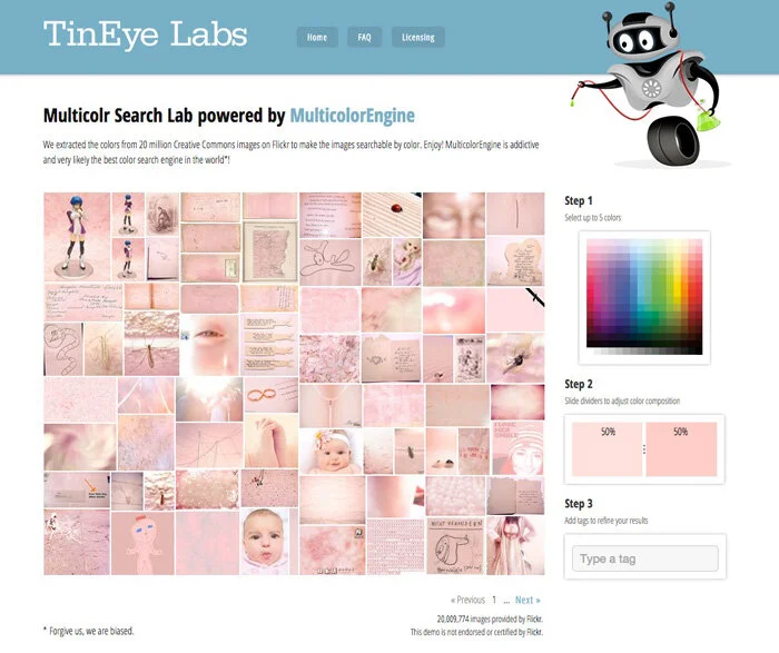
But there are other color tools that are quite fun: Multicolr Search Lab allows you to select up to 5 colors and it will populate a bunch of images from Flickr comprised of those colors.
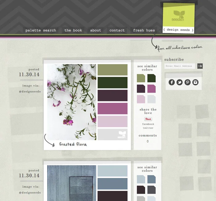
Design Seeds has always been a favorite of mine. They choose beautiful photos and then create a color palette off of it. This site is great for inspiration.
Key Takeaways on Color and Design
To have a higher success rate with color, use my tips:
Start with content placement first, in black and white
Choose one color from pre existing branding or a previous design
Stay in the same color scheme with tints and shades of that color by using a Color Calculator
If you want to use multiple colors within your design, use them sparingly for important call-to-actions
I hope these tips were helpful. Please share your tips in the comments below on how you work with color in your blog or for clients.
Cover photo by Markus Spiske

